Poppy Camper Vans
Mobile App Concept
Background
Case Study
I came up with this product concept while I was looking into building a custom camper-van during the pandemic. I loved the idea of being able to participate in the vanlife movement - but quickly realized that it was an expensive and time-consuming project for something I wouldn’t be able to use many months out of the year. The problem is that many travelers can’t afford to own and customize their own vans. Those that are able to build their own camper vans aren't going to be living in it full-time once the pandemic ends.
So I came up with the concept for Poppy, designed to allow van-life enthusiasts to connect with and rent custom built - from private owners who aren't using their vans full-time. Especially after the pandemics - many van lifers who worked remote had to park their vans for the reintroduction of in person work environments. This would give van owners an opportunity to make some cash on the side while also allowing van-less travelers to have access to unique and custom built privately owned campervans.
Role
UX Researcher, UI Designer
Duration
3 weeks
Goal
Conceptualize an app that allows campervan owners to rent out their unique vehicles to travelers wanting to temporarily live out of a van.
Ideation and Definition
Research Objectives
I needed to discover which features to prioritize in this design sprint. I crafted a user research plan. I wanted to understand what was appealing about vanlife travel. I wanted to discover the potential roadblocks of van-life. I wanted to find out where travelers get inspiration - what kind of experiences they desire.
User Interviews
I interviewed 6 people in person ranging in ages 20 - 28. Before interviews, I created a script that would meet my research objectives. I learned that flexibility is important in user interviews. Created a script was necessary and I referred to it often, however I also tried to follow where each individual user wanted to take the conversation as long as it met research objectives. I used Miro to organize my interview notes into data points.
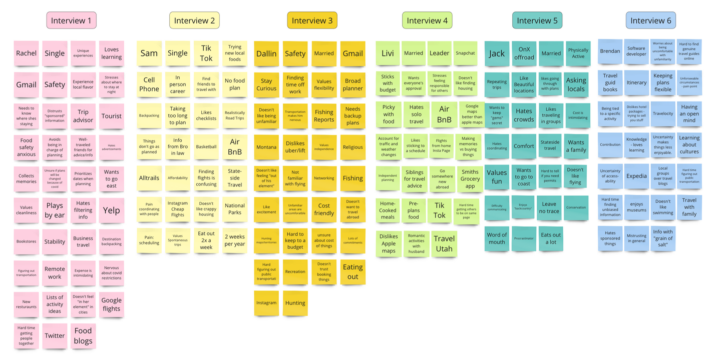
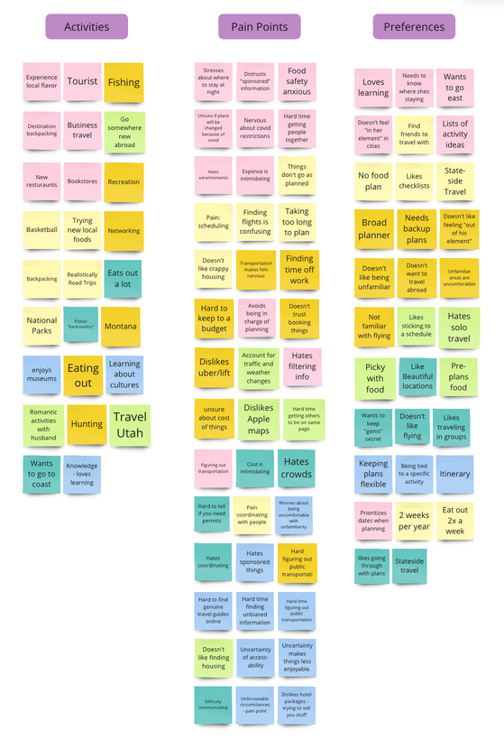
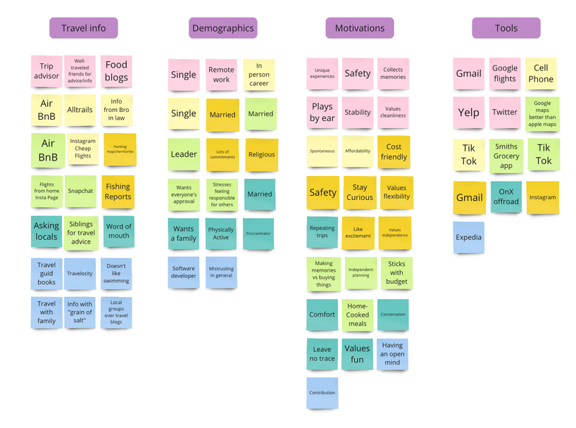
Findings and Affinity maping
I conducted 6 informal interviews with players at a pickleball tournament. After organizing the user insights with tools like affinity diagrams, and empathy maps I discovered that users value: fast and easy onboarding, quick independent planning process, upfront cost, and van life recommendations from experienced travelers.
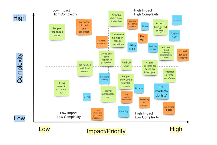
Feature prioritization
Creating a feature prioritization helped me brainstorm and prioritize realistic and relevant achievable features that this product could offer potential users.
Creating the user experience
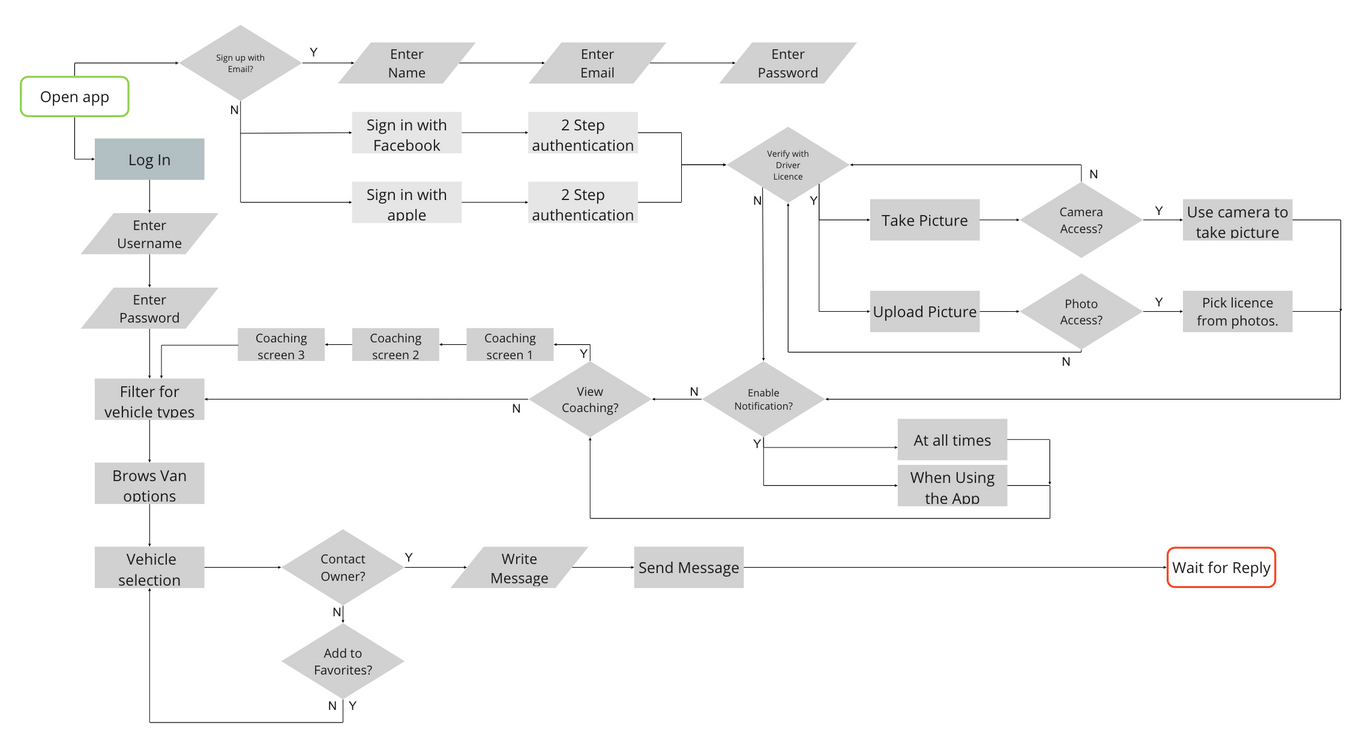
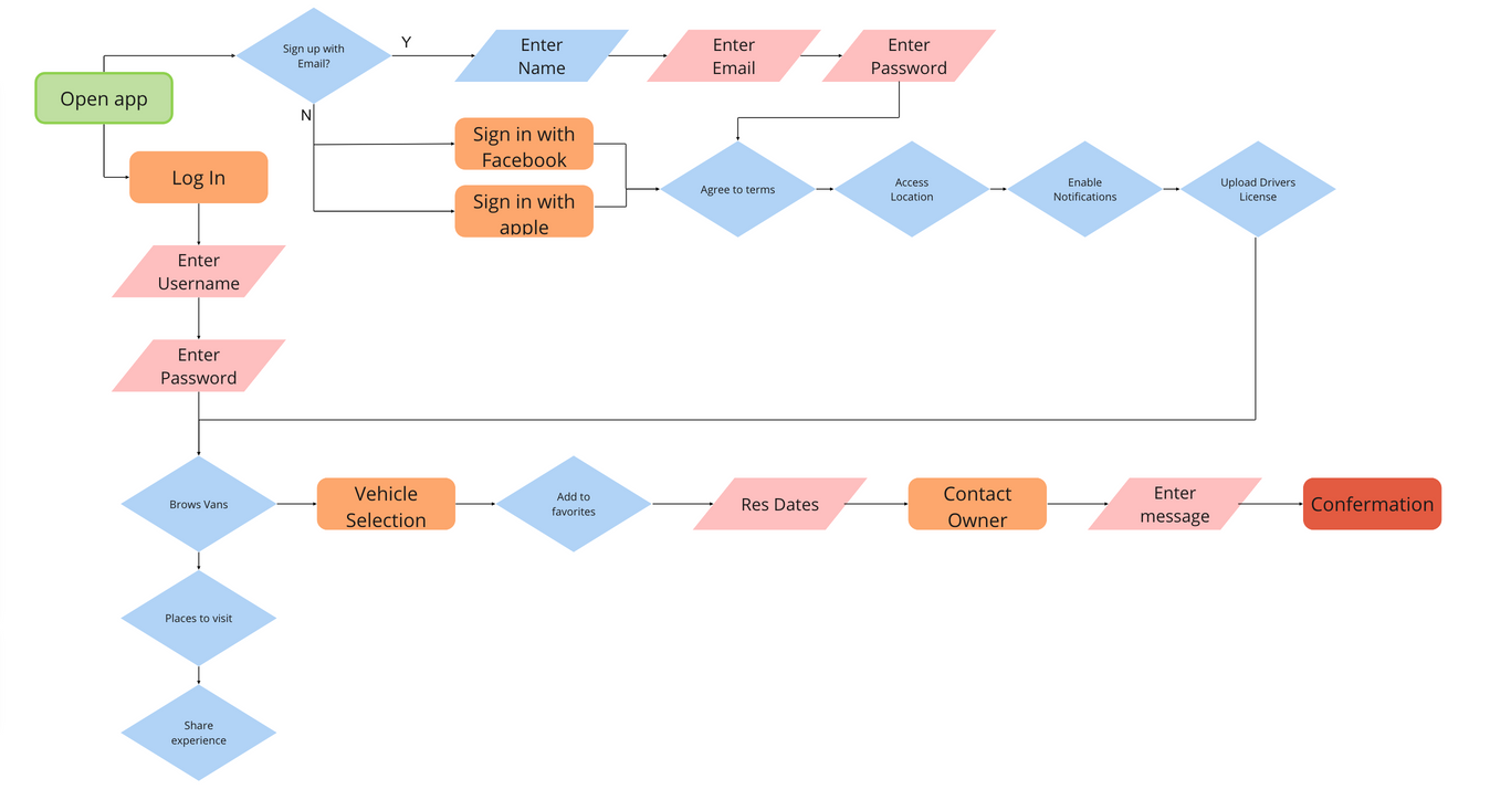
In order to help users complete their goals, I created two user flows. One for onboarding and one for browsing and selecting vans to rent.
User Flows
I created 3 iterations of a basic user flow to map out the user journey. The first iteration was a penciled sketch, and not included below. This was helpful to refer while prototyping because as it was a design sprint - I wanted to avoid getting caught up with unnecessary features and simplify achieving user goals. Iterations of this flow included cutting down on steps like coaching screens that - while possibly helpful - was not a priority or among the necessary designs that was needed to achieve user goals.
Design Process
Initial iterations
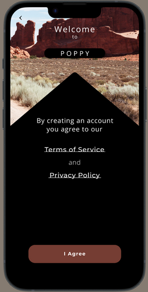
My goal was to create an intuitive design that didn’t need a “learning curve” for onboarding new users as well as navigating the main screens of the app concept. I wanted to incorporate a trustworthy/legitimate feeling to the onboarding process. I referred to my user flow as well as my affinity maps and feature prioritization matrix to make sure I was including all objectives in my design.
First Sketches
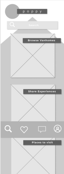
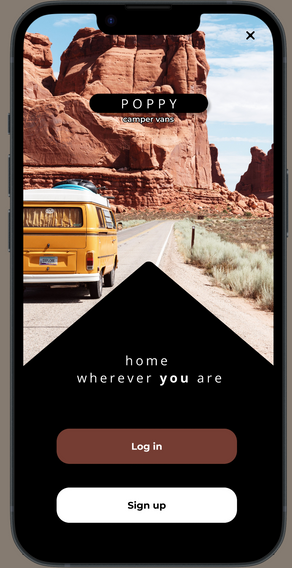
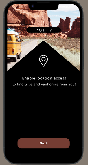
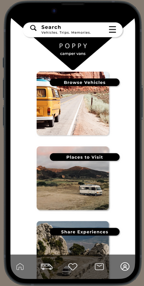
I mapped out a simple sketch of the layout of my prototypes. I wanted to have a geometric aspect to my design to give it a feeling of uniqueness and balance. The triangle shape was chosen because it felt like an abstract representation of a road disappearing into the distance as well as referring to the representation of a home.
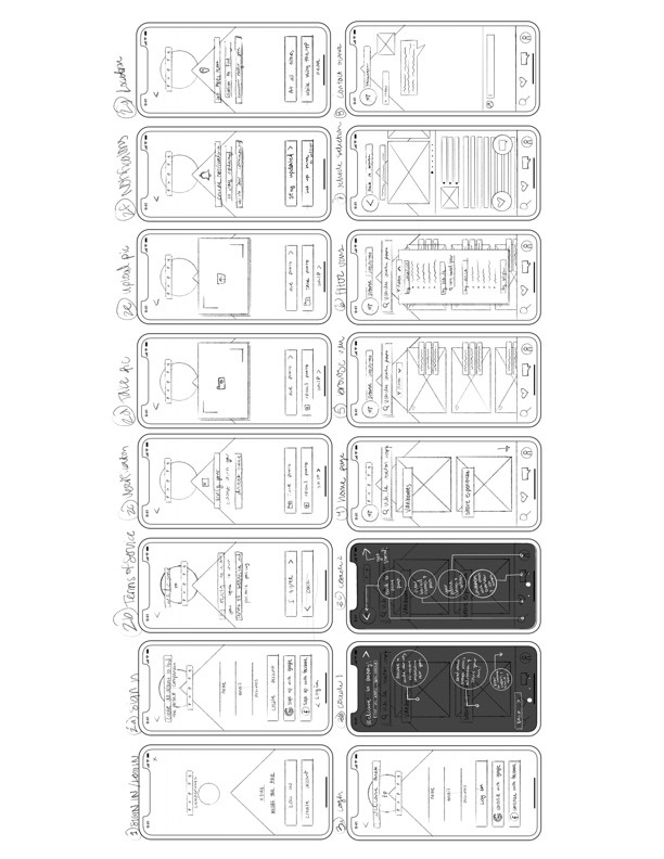
Low Fidelity Prototypes
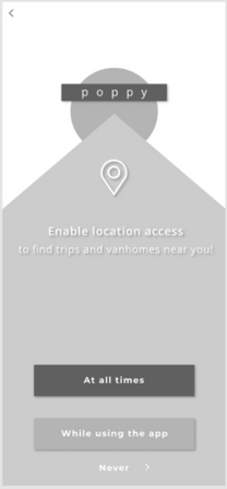
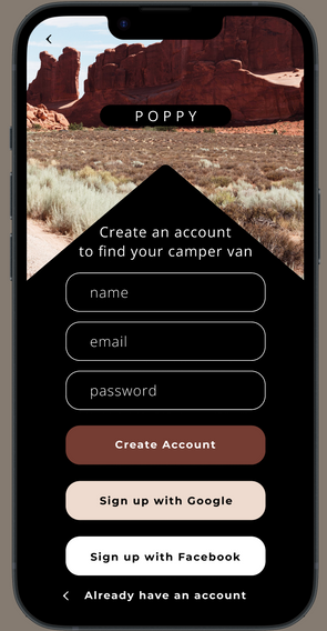
Using figma, I was able to transfer my initial designs and play with the font and value balance. I moved onto adding color in later iterations (still low-fidelity). I chose black, white, and maroon color as a nod to the flower the app was named after. I took inspiration from landscape and colors of southern utah. I liked the natural burgundy tones associated with "dirtbag” environments . I kept the shape of a point disappearing into the distant (reminiscent of a road going on forever and disappearing with perspective.) In later iterations, I got rid of the lighter peach color so that it felt more gender-neutral.
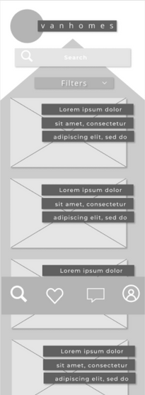
High-Fidelity Protoype
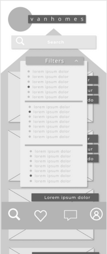
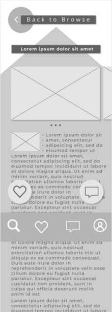
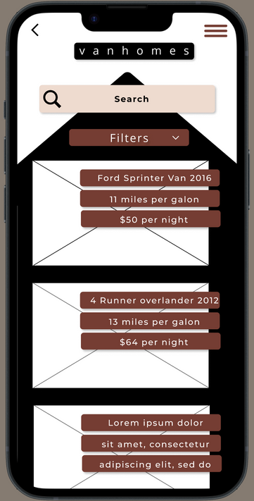
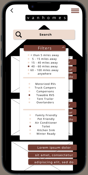
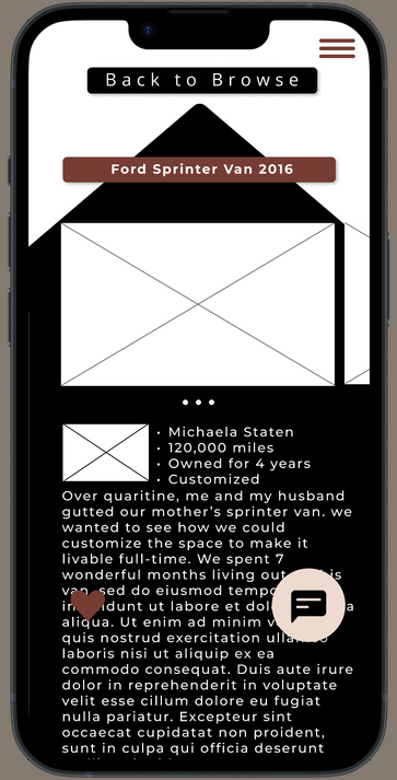
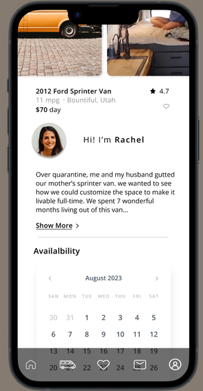
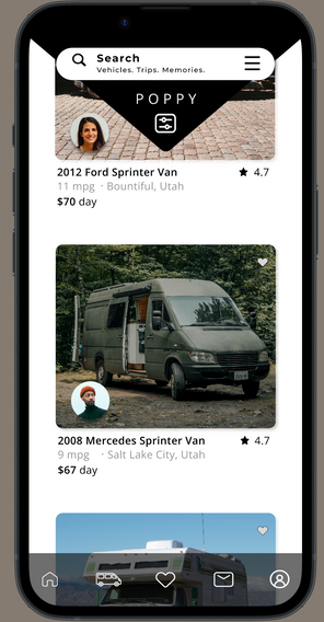
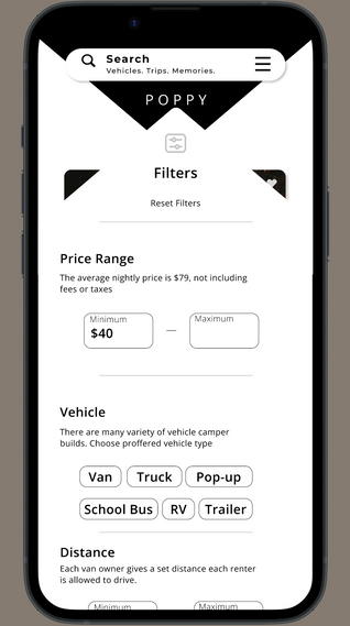
In the high fidelity iterations. -I rounded corners of buttons and the triangular shape to soften and modernize the look. I made the buttons interactive. On the home page, I got rid of the background "triangle" but kept the shape in the header for continuity across pages. I leaned toward having the background white -in contrast to the login page and onboarding pages - in order for information to be more easily viewed. In later iterations, I also changed the layout of the van listings to a more simplistic design with the information under the image instead of in a text box on top. I kept this feature in the initial home page because the it didn't take away from highlighting the pannel title. I also added the option to view and reserve calendar dates under availability when viewing a vehicle listing.
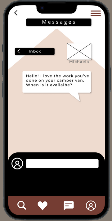
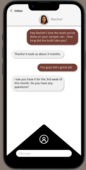
Main user task I created prototypes for was onboarding, browsing and connecting with van-owners, I wanted the user to be able to communicate with fellow travelers this from multiple areas in the app.
Results
Reaching case study goals
With this mobile concept, the paint points people expressed during interviews in regards to traveling were able to be addressed and avoided. The app provides a platform for people interested in the van life movement and way of traveling to be apart of the community and gain access to unique and customized vehicles. With traveling, using a. van is a car rental and airbnb mixed into one. Users would have access to means of transportation as well as housing accommodations
Take-Aways
During this case study - I learned the value of user input. I had theories and ideas as to what travelers wanted and/or had a hard time with but I was met with insights that I wouldn't have been aware of through these user interviews. This really added value to my designs. I was able to refer to data points and understand user motivations that I tried to channel into the design prototypes of this app with aspects such as community, pricing, and direct contact. This case study really opened my eyes to how useful gathering and organizing these insights are for the design process.
I also learned that with design sprits it was easy to get caught up in designs that weren't high priority. Having clear objectives and prioritized goals helped me not to lose focus in my design as well as avoid attempting to "boil the ocean" in the short timespan this case study gave.